s3-kennisbank
Single Value Custom Components
Using the input components boilerplate, we’ve created a Topics fieldset where users can rate a topic using either a number input or a range input. This setup works, but it introduces two key issues:
- Lack of synchronization: The number input offers precision, while the range input is more user-friendly. However, they currently operate independently, changing one doesn’t update the other. We want them to stay in sync so that updating one automatically updates the other.
-
Lengthy render method: The
render()method that generates the HTML for these inputs is quite lengthy and repetitive, which also triggers ESLint warnings.
Our Goal
We aim to build a custom web component that combines both the number and range inputs into a single, synchronized unit. This will not only streamline the user experience but also reduce the amount of HTML in the render() method.
There’s real value in this approach: by encapsulating each input field in its own component, we keep the logic for each User Story self-contained and separate from others. This results in a cleaner, more maintainable codebase and a more structured render() method. While the benefits are clear, implementing such a component comes with its own set of challenges.
The Number-Range-Input Component
From the render method of the EvaluationForm component, we can derive that our new component should have the
following attributes:
-
label: The label for the input. -
name: The name of the input. -
min: The minimum value of the input. -
max: The maximum value of the input. -
required: Whether the input is required or not. -
value: The value of the input.
The name attribute plays a crucial role in form submission. If it's missing from an input element, the browser won’t include that input’s value in the submitted form data, meaning the backend won’t receive it. So, even though the name attribute doesn’t influence the internal behavior of the component itself, it’s essential to include it on the input element to ensure proper data handling during form submission.
In short: the name attribute is irrelevant to the component’s internal behavior, but essential for successful form submission.
Now, let’s create a new file called number-range-input.js inside the src/view/components folder and begin implementing the component.
import { LitElement, html, css } from "lit";

export class NumberRangeInput extends LitElement {
  static styles = css`
    :host {
      display: grid;
      grid-template-columns: 1.5fr auto 10fr;
      align-items: center;
      width: 100%;
    }

    label {
      display: block;
      margin: 0.5rem;
      padding: 0.5rem;
    }

    input {
      margin: 0.5rem;
      padding: 0.5rem;
    }

    input[type="number"] {
      width: 3rem;
      font-size: 1.5rem;
    }

    input[type="range"] {
      width: 50%;
    }

    datalist {
      display: flex;
      margin: 0 0.5rem;
      padding: 0 0.5rem;
      justify-content: space-between;
      width: 50%;
    }
  `;

  static properties = {
    label: { type: String },
    min: { type: Number },
    max: { type: Number },
    required: { type: Boolean },
    value: { type: Number, reflect: true },
  };

  constructor() {
    super();
    this.required = false;
    this.min = 0;
    this.max = 10;
    this.step = 1;
    this.value = this.min;
  }

  firstUpdated() {
    this.shadowRoot.querySelector("#number-input").value = this.value;
    this.shadowRoot.querySelector("#range-input").value = this.value;
  }

  numberInputHandler(event) {
    this.value = event.target.value;
    this.shadowRoot.querySelector("#range-input").value = this.value;
  }

  rangeInputHandler(event) {
    this.value = event.target.value;
    this.shadowRoot.querySelector("#number-input").value = this.value;
  }

  render() {
    return html`
      <label for="number-input">${this.label}:</label>
      <input
        type="number"
        id="number-input"
        name="number-input"
        min="${this.min}"
        max="${this.max}"
        ?required="${this.required}"
        @input=${this.numberInputHandler}
      />
      <div>
        <input
          type="range"
          id="range-input"
          name="range-input"
          list="values"
          aria-label="${this.label}"
          min="${this.min}"
          max="${this.max}"
          ?required="${this.required}"
          @input=${this.rangeInputHandler}
        />
        <datalist id="values">
          ${Array.from({ length: this.max + this.step }).map(
            (_, index) =>
              html` <option value="${index}" label="${index}"></option> `
          )}
        </datalist>
      </div>
    `;
  }
}

customElements.define("number-range-input", NumberRangeInput);
Also let's make some small changes to the EvaluationForm component, to use the new number-range-input component.
import { LitElement, html, css } from "lit";
import './number-range-input';
export class EvaluationForm extends LitElement {
...
static styles = css`
...
/* .evaluation-topics {
grid-template-columns: auto auto 1fr;
align-items: center;
} */
...
`;
...
render() {
return html`
<h1>Evaluation Form</h1>
<form @submit=${this.submitHandler}>
<fieldset class="cursist-info">
<legend>Cursist Information</legend>
<label for="name">Name:</label>
<input type="text" id="name" name="name" required />
<label for="address">Address:</label>
<input type="text" id="address" name="address" required />
<label for="phone">Phone:</label>
<input type="tel" id="phone" name="phone" required />
<label for="email">Email:</label>
<input type="email" id="email" name="email" required />
</fieldset>
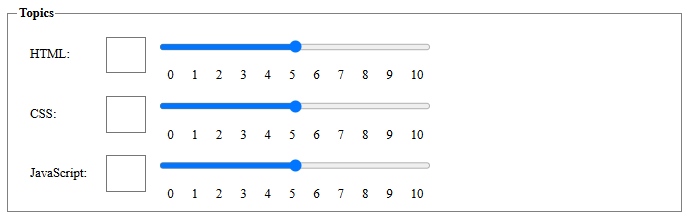
<fieldset class="evaluation-topics">
<legend>Topics</legend>
<number-range-input name="html" label="HTML" min="0" max="10" required></number-range-input>
<number-range-input name="css" label="CSS" min="0" max="10" required></number-range-input>
<number-range-input name="javascript" label="JavaScript" min="0" max="10" required></number-range-input>
</fieldset>
<button type="submit">Save</button>
</form>
`;
}
}
customElements.define("evaluation-form", EvaluationForm);
The new code in the number-input-range component links the changes of number input with range input, and vice versa. It does this via two event handlers (called rangeInputHandler() and numberInputHandler()). Internally we use the reactive property value. Using value as a reactive property is smart, as any change would generate a re-render of the component. The result in the UI is that the number and range input are now related to each other. This was one of our goals.
In the number-input-range component we initialize values in the firstUpdated method as when this method runs the shadow DOM has been initialized. We cannot initialize them in the connectedCallback method as when this method runs the shadow DOM is not yet loaded, and thus we can't place the values into the HTML elements of the shadow DOM.
New challenges: Front-End validation
So far, we’ve made solid progress, but now we’re facing a few new challenges:
- The
requiredattribute isn’t working. Even if you leave fields empty, the form still submits. - The
minandmaxattributes don’t prevent invalid values. You can enter anything, even negative numbers. - The
valueof thenumber-range-inputcomponent is reflected correctly, but it’s not included in the form data when submitted.
To solve these issues, we need to use the ElementInternals elements (like our number-range-input) behave like regular form elements (<input>, <select>, etc.).
With ElementInternals, we can:
- Make custom inputs work properly in forms, so they can be validated and submitted like native inputs.
- Improve accessibility, so screen readers and other assistive tools can interact with them correctly.
This API is part of the Forms module.
Setting the value
The first issue we will address is that the value attribute of the number-range-input component is not included in
the form data when the form is submitted. The first thing we do to set up the ElementInternals in our component is to
add a private property 'internals' to our component. In JavaScript private properties are prefixed with a #.
export class NumberRangeInput extends LitElement {

  #internals;

  static styles = css`
  ...
  `;
Next we have to initialize our #internals property in the constructor method of our component by calling the
attachInternals method of our component. This method returns an ElementInternals object that we can use to set up
the form-associated custom element.
...
  constructor() {
    super();
    this.#internals = this.attachInternals();

    this.required = false;
    this.min = 0;
    this.max = 10;
    this.step = 1;
    this.value = this.min;
  }
...
When you create a custom form element (like this NumberRangeInput), it doesn't automatically integrate with HTML forms. That means if you put it inside a <form> and submit the form, its value won't be included by default.
By calling this.#internals.setFormValue(this.value) you're telling the browser: "When this form is submitted, include this value as if it were a native input element." This makes the custom element form-associated, meaning it behaves like a regular <input> in terms of form submission, validation, and so on.
  setValue(value) {
    this.value = value;

  // Register the value with the browser's form system using ElementInternals.
  // This makes the custom element form-associated, so its value is included
  // when the parent <form> is submitted.
    this.#internals.setFormValue(this.value);
  }
Next we have to add the setValue method to all methods that are setting the value of an input field, so that the value
of the component is always in sync with the value of the input fields.
  firstUpdated() {
    this.shadowRoot.querySelector('#number-input').value = this.value;
    this.shadowRoot.querySelector('#range-input').value = this.value;
    this.setValue(this.value);
  }

  numberInputHandler(event) {
    this.setValue(event.target.value);
    this.shadowRoot.querySelector('#range-input').value = this.value;
  }

  rangeInputHandler(event) {
    this.setValue(event.target.value);
    this.shadowRoot.querySelector('#number-input').value = this.value;
  }
If you now run the application, you will get an error in the console at the setFormValue method, stating that the
element is not a form-associated custom element.
To fix this, we have to add a static property formAssociated to our component and set it to true. This tells the
browser that our component is a form-associated custom element.
export class NumberRangeInput extends LitElement {

  #internals;

  static formAssociated = true;
If you now run the application, fill the form and submit it, you will notice that the data of our number-range-input
components is included in the form data. However, the required attribute of the input elements is still not working,
and the min and max attributes of the input elements are not working either.
Setting the constraints
The range slider and the number up/down buttons on the input elements are working as expected and prevent us from
entering values that are not within the range of the min and max attributes. But we can still enter values in the
input field that are not within the range of the min and max attributes, which will be included in the form data
when the form is submitted, without any validation check. This is why we will focus on the validation of the number
input field.
Let's start by checking if the value we enter in the input field is valid, by using the validity check method provided by the DOM API.
  numberInputHandler(event) {
    const isValid = event.target.checkValidity();
    console.log(isValid);

    this.setValue(event.target.value);
    this.shadowRoot.querySelector("#range-input").value = this.value;
  }
If we enter a value that is not within the range of the min and max attributes, the checkValidity method will
return false.
We can use this boolean value to use the DOM API again to report to the user that the value is not valid, using a standard message of the browser.
  numberInputHandler(event) {
    const isValid = event.target.checkValidity();
    if (!isValid) {
      event.target.reportValidity();
    }

    this.setValue(event.target.value);
    this.shadowRoot.querySelector("#range-input").value = this.value;
  }
Handling Invalid Input and Component Validity
Now when a user enters a value outside the defined min and max range, the browser displays a default validation message using reportValidity(). At this point, we face a decision:
-
Option 1: Stop execution with a
returnafterreportValidity(). This prevents the invalid value from being set in the input field, but the component’s internal value remains unchanged. This can be confusing because the input field displays the invalid value, while the component retains the last valid one. - Option 2 (chosen): Allow the invalid value to be set in the input field and update the component’s value accordingly. This keeps the UI consistent but requires additional validation when the form is submitted.
To ensure invalid values are not accepted during form submission, we use the setValidity() method inside the setValue() method:
setValue(value) {
  this.value = value;
  this.#internals.setFormValue(this.value);

  const numberInput = this.shadowRoot.querySelector("#number-input");

  const validity = numberInput.checkValidity()
    ? {}
    : {
        rangeUnderflow: this.value < this.min,
        rangeOverflow: this.value > this.max,
      };

  this.#internals.setValidity(
    validity,                     // Validation flags
    numberInput.validationMessage, // Browser-generated message
    numberInput                    // Element to focus on
  );
}
Here’s what happens:
- Validation Check: We use checkValidity() to verify the input’s validity.
-
Set Validity Flags: If invalid, we create a flags object with
rangeUnderflowandrangeOverflowto indicate the issue. -
Set Component Validity: We call
setValidity()with:- The flags object
- The browser’s default validation message
- The input element as the anchor for error focus
This ensures that:
- The component reflects the current (even invalid) input value
- The form will not submit if the value is invalid
- The user receives clear feedback on what went wrong
Even if the input is cleared, the field remains invalid due to the required attribute, and the form submission is blocked.
Conclusion
In this tutorial, we built a synchronized number-range input component using LitElement, improving both usability and maintainability. We tackled key challenges like input synchronization, form integration, and validation using the ElementInternals API. By making our custom component form-associated, we ensured proper data submission and validation behavior.
Sources
- MDN - ElementInternals
 Home |
  Input components |
  Lit Web Components | Multiple values input components